This is the first of a three-part series on the additional changes to Sunny Hills facilities over the summer and during the 2024-2025 school year. These updates follow the larger makeover that started in the previous school year with a campus-wide painting project followed by new signage in hallways and outside athletic facilities. The Accolade will focus first on the new logos that replace the ones that got painted over two summers ago.
Ten.
That’s the amount of new logos that canvassed the campus last summer or within the first few months of the 2024-2025 school year.
Of the 10, three were replacement ones for those that got painted over two summers ago as part of a $400,000 painting makeover of the campus walls and lockers. The rest got installed onto the following locations for the first time:
- one outside Room 136, where the video production class is held, costing $400
- two outside Room 44, where the coding and gaming courses and eSports club meet, costing $254.23 each
- one between Rooms 62 and 64, where the AVID wing is located, costing $200
- two at the awning above the choir and band rooms, costing $215 each
This project cost nearly $8,700, which includes the cost of labor to put up each logo, according to an itemized invoice from Fullerton-based Fastsigns that assistant principal Sarah Murrietta shared with The Accolade.
Outside Room 130, where instructor Leiana Volen teaches her dance classes, the top wall left of the door used to feature a dancer in a ballet pose before it got painted over two summers ago.
Volen said she worked with a graphic designer for two months before coming up with seven to 10 designs, submitting the final one Dec. 1, 2023, to assistant principal Sarah Murrietta, who then contacted Fastsigns like two years ago to install the logos.
The 84-inch-wide-by 30-inch-high sign costing $295 contains the words, “Sunny Hills,” on one line followed by “Dance” below. The color of each letter follows part of the school colors – black – while the Lancer gold highlights the text in a banner-shaped background.
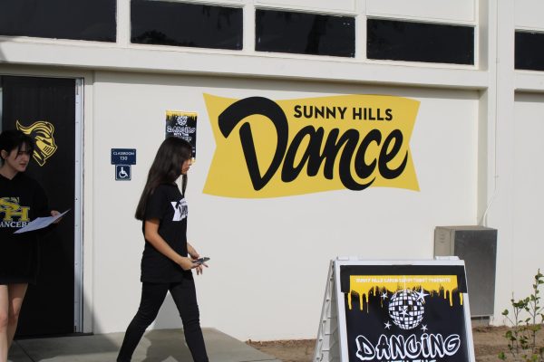
“The final look is clean, simple, modern and has some movement,” the dance teacher said. “The designer did great.”
Besides adding some color to the right of the door to her classroom, Volen said the interior of her room was also painted over last summer to a sleek, black.
“I feel like the color looks really nice,” she said. “My returning dancers commented like, ‘Whoa, it looks so good in here.’”
Senior Jharlize Estonactoc, who’s also in Volen’s first period class, is among those students Volen was referring to.
“Seeing the sign before I walk in makes me feel proud, since dancing is so amazing,” Estonactoc said. “The interior looks amazing inside; it feels so welcoming and comfortable even with just a little color change.”
Volen wasn’t the only teacher in the 130s building to get a replacement logo. Auto tech in Room 131 and The Accolade in Room 138 also had their designs placed outside their walls over the summer.
The previous auto tech sign involved two car pistons in the shape of an “X” with the text in white font that reads, “Sunny Hills High School,” above the words, “Auto Technology.” Each phrase was encapsulated in a black ribbon.
THE SECOND TIME AROUND FOR AUTO TECH AND ACCOLADE LOGOS
Unlike Volen, the auto tech teacher said he decided to ask his students to come up with a replacement design during the previous school year. Munoz then chose the Top 5 sketches and emailed them to Murrietta, who selected the final one on Friday, April 12.
The 71-inch-wide-by 60.5-inch-high drawing – created by then-senior Cali Watson – cost $425 and features two car pistons in the shape of an “X” above a black rectangular sign with the white text, “Sunny Hills High School,” on top of “Automotive Laboratory.” A car outlined in gold splits the words “Automotive” and “Laboratory” while the ROP [Regional Occupational Program] logo rounds out the design at the bottom.
“I hope that it conveys that we’re not just a basic greasy and dirty auto shop; we do a lot of other things,” Munoz said. “My kids in the [Intro to Automotive Tech course] are learning Ohm’s law and the theories of electricity, which are things that you don’t usually get in an auto shop.”
Auto tech student senior Edwin Jimenez noted a benefit from the new and changed sign.
“Before, you had to know where the room exactly was for programs like Auto Tech, Accolade, and dance,” Jimenez said. “I like the pistons in the design the most because I was in the engine building team, and pistons were major parts of it.”
From a different perspective, auto tech student senior Jared Dye compared the old and new signs and determined that the current one looks better.
“It looked run down and just not great, unlike now, where it shows that we have a lot going on and tells people to check auto tech out,” Dye said. “The moving pieces, like the pistons, incorporated into the sign are pretty awesome.”
The Accolade’s 84-inch-wide-by 46.5-inch-high logo – costing a bit over $300 – came from last year’s online graphics editor and then-senior, Iris Kim, who like Watson graduated earlier this May. The sign is the same one that The Accolade’s online news website started using last October.
It features a sun behind the black words, “the” and “Accolade.” Underneath rests the statement in cursive black font, “Bringing the next generation of news to you,” and the website address, “shhsaccolade.com.”
The old one also featured a different font – a cursive one – for the brand name with an old-style pen underneath and the word, “Newspaper,” below that.
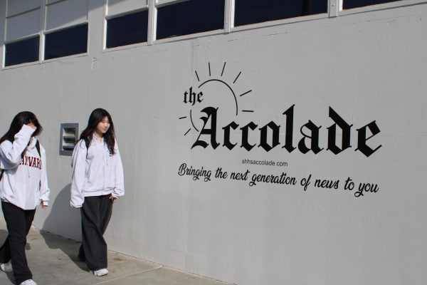
“I’m really proud of Iris for coming up with that logo, especially with the sun in the background,” Accolade adviser Tommy Li said. “I added the words at the bottom because it’s important for our campus to know that we want to appeal to their interests, which is why we want to produce the next generation of news for them.”
Accolade managing editor senior Christine Yoo recalls the differences between the two looks.
“One aspect I like [with the new one] is how we added the website link, which I think shows how we really are trying to bring the next generation of news through modern methods,” Yoo said.
Similarly, editor-in chief senior Alexxa Berumen reflects on her feelings between the past and present markings.
“I like the new sign although I do miss the old one; I think that the new one represents our current logo well,” Berumen said. “I also like that last year’s online graphics editor Iris Kim was able to help design it, so it acts as a way to remember her and that year’s staff.”
The one thing Li said he didn’t realize during the process of submitting the design to Murrietta was that the logo could be in color. So upon checking with the administrator, he said the assistant principal told him the Fastsigns workers can come back to add highlights of Lancer gold for the sun part of it.
“I’m looking forward to seeing that, and I believe it will draw more attention to our program, especially since the design is on the wall facing the path where parents drop off their children before school starts and pick them up after the school day ends,” the journalism instructor said.
REACTIONS TO OTHER PROGRAM SIGNS

Video production, which uses Room 136, never had a sign next to its entrance door until last summer. The 50-inch-wide-by 57-inch-high design consists of a black-and-white slate with “VIDEO PRODUCTION” and the logos of the North Orange County ROP and Sunny Hills, an official student-made video production logo.
“Four years ago, we wanted to make T-shirts to promote the program, and we needed a design,” video production teacher Daniel Flores said. “We had our students come up with a variety of options, and the class voted for then-junior Sasha Flores’ design.”
The teacher said the design serves a beneficial purpose for the program.
“I believe it’s a great way for people that are either new to our campus or visitors to know what we have to offer at our campus,” Flores said. “The new building signs are like a collection that go around this entire corridor so you know which program is being featured in that classroom.”
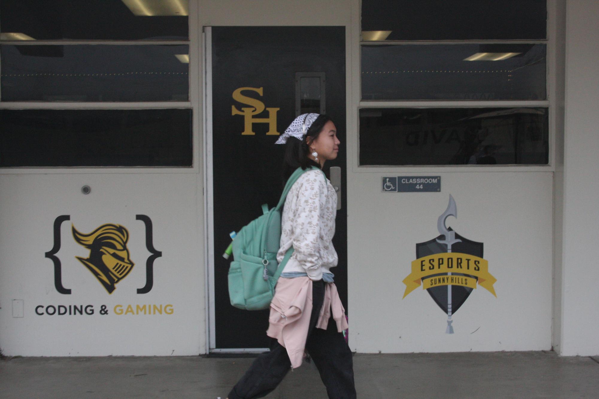
Computer science teacher Sonya Joyce said Murrietta was the one who suggested adding a gaming and coding sign next to the eSports one to be placed in the 40s wing.
“I designed it myself with the idea of what stands out in the coding world to symbolize programming, and the open and close brackets are used in a lot of programming languages,” said Joyce, who teaches two gaming and coding classes. “I looked online for some inspiration and decided to add the Lancer head to it to pull it together to represent Sunny Hills.”
Like the logo that the computer science instructor came up with, the eSports club one has the same dimensions at 40 inches wide by 36 inches high and placed in front of Joyce’s class, Room 44.
The eSports logo, which features a silver pole arm in front of a dark, gray shield and the text “ESPORTS” above “SUNNY HILLS” in black over gold ribbons, was created back in 2014, when the club was first founded by then-senior Tiffany Le, who went to work at Blizzard Entertainment and later on Riot Games, computer science teacher Myra Deister said.
Senior Angel Rodriguez, eSports secretary, is among those who appreciate the branding.
“I think the logo is an awesome way to quickly recognize the eSports club and a well-designed symbol to feel connected to,” Rodriguez said. “The main thing I like the most would be the shield crest; it makes a cool silhouette for the logo.”
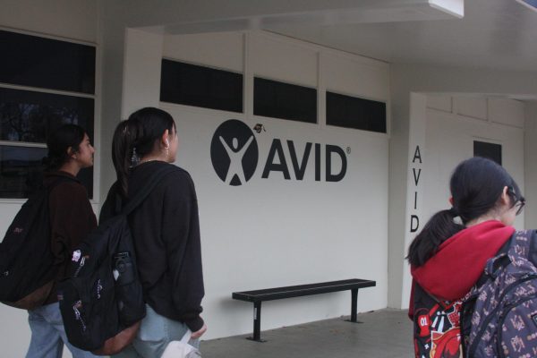
The AVID logo, on the other hand, simply states the program’s name in a horizontal fashion, contrasting previous markings on columns of the 60s wing that have the program’s name in a vertical manner.
For the new logo on the rectangular-shaped wall outside the boys PE locker room, returning, students walking past it saw something quite different when the 2024-2025 school year started.
What they saw was a black splotch on the wall.
The old marking of “LANCERS” in black lettering with gold outline and a black lance underneath eventually got replaced with the SH black-and-gold lancer’s head, and “SUNNY HILLS ATHLETICS” above and “HOME OF THE LANCERS” below in black and gold font.
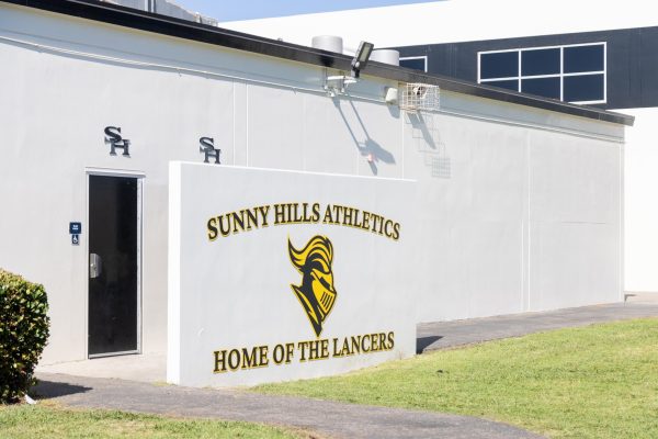
Sophomore Jeriz Gumapal, who has PE fifth period, complimented the new look.
“I think it looks really nice because it makes that area more vibrant and appealing,” Gumapal said.
NEW VERTICAL BANNERS HANGING DOWN FROM LAMP POSTS
The campus light posts at two parking locations on campus got a new look last summer.
The Fastsigns company installed five new ones outside the main office parking lot, while the west parking lot that leads to the tennis courts have five deeper vertical banners, which school administrators said didn’t cost the school a penny.
That was because Fastsigns initially brought new banners for outside the main office; however, they didn’t fit – being too large – so upon trying them onto the lamp posts on the west parking lot, those worked out, and that’s how the freebie came about, school officials said.

Two types of banners alternate in appearance along the poles, two of the first being a white one with a black-and-gold outline, “HOME OF THE LANCERS” at the top and a black-and-gold lancer head.
The other kind has three with a white background outline in black and gold, with the California Distinguished School on top and the text “CALIFORNIA DISTINGUISHED SCHOOL” below.
Senior Richard Lu, who uses the west parking lot when he arrives on campus, said he noticed a familiarity with the banners.
“They remind me of the banners that are in Downtown Fullerton that have [California State University, Fullerton] students on them,” Lu said.
Junior Jaden Joo agreed.
“The banners remind me of the banners you see on college campuses,” Joo said. “Also, I think the size and the color of the banners make [the banners] easy to find and stand out.”



![Students pass by the new auto tech program sign – created by then-senior Cali Watson – that features two car pistons in the shape of an “X” above a black rectangular sign with the text “Sunny Hills High School” on top of “Automotive Laboratory.” A car outlined in gold splits the words “Automotive” and “Laboratory” while the ROP [Regional Occupational Program] logo rounds out the design at the bottom.](https://shhsaccolade.com/wp-content/uploads/2024/12/IMG_2505-1200x800.jpg)

![Students and staff across the Fullerton Joint Union High School District [FJUHSD] received emails promoting a part time job offer with pay. The messages were set from compromised FJUHSD accounts.](https://shhsaccolade.com/wp-content/uploads/2025/09/image1-2-1200x527.png)
